Help / Settle and calibrate a screen
Standard screen settings
A monitor, whether fixed or portable, has a brightness setting*.
The screen works on the basis of backlighting to display all the visual elements of your workstation.
Most fixed monitors have physical buttons with a menu of settings (contrast, brightness, colours...).
Laptop monitors have the same settings, but this time internally, so you can change them electronically.
A screen that is not calibrated correctly and/or whose screen display deviation from the print is known and managed by you can be quite satisfactory for preparing your future prints.
Generally the menus concerning brightness describe a percentage scale from 0 to 100, 0 being the minimum brightness of the screen backlight and 100 the maximum value *.
Caution:
Displays are often delivered with a default brightness setting that is far too high for preparing photographic prints!
If this high brightness enhances the display of your image on the screen in order to obtain a flattering rendering, the quantity of light is not adapted to prepare photo prints which will be viewed under a much less bright light.
You should not hesitate to reduce the brightness by 30% to 50% from the factory setting.
Quickly evaluate your screen
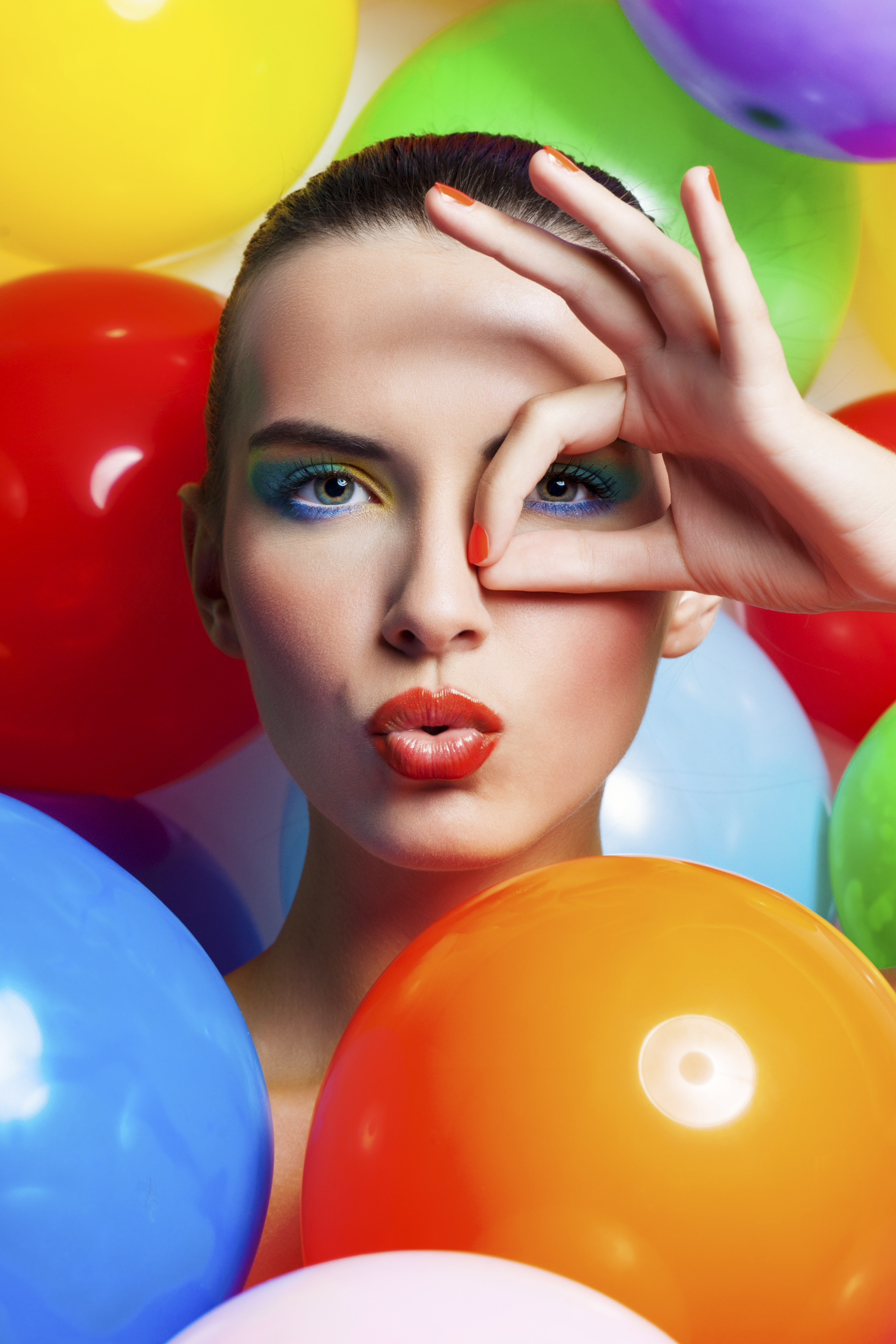
In the "Quickly evaluate your screen" help page, you can download a PICTO image and display it on your screen.
For more information: "Quickly evaluate your screen"
In summary :
- Avoid modules that automatically adjust the brightness of your screen.
- To ensure that you can judge your images consistently from one day to the next, choose a brightness and never change it again.
- Be careful not to render your screen too flattering, impossible to reproduce on a print:
- Avoid exceeding 50-60% of the brightness scale.
- Stay between 30 and 50% of brightness for your monitor.
An acceptable luminance for image management and comparison should be between 80 and 160 cd/m2. There are two types of standard settings available for brightness: electronic (directly on the screen (hardware setting) and computer (via the computer's operating system (OS) or the software of the graphics card).
Going further...
Calibrated screen settings
There are a multitude of online resources on screen calibration, oriented to the destination of your images, whether for on-screen display or for printing.
Here are our recommendations specific to the printing field, distinguishing two cases:
Case 1 / Practical evaluation*:
Your images are destined for printing, and you have office-type ambient lighting for practical observation of the prints, the settings to be favored are as follows:
- Color temperature: D50 ; 5,000 K , +/- 500 K
- Gamma: 2,2
- Luminance: 90 cd/m2 ,+/- 10 cd/m2
- Print viewing plane illumination: 500 lux , +/- 125 lx
Case 2 / Critical comparison:
Your images are intended for printing for printing, and you have professional, standardized and you have professional, standardized print evaluation equipment (e.g. JUST Normlicht console).
We recommend the following settings:
- Color temperature: D50 ; 5,000 K , +/- 500 K
- Gamma: 2,2
- Luminance: 120 cd/m2
- Print viewing plane illumination: 2000 lux , +/- 500 lx (Condition P1, in compliance with international standard ISO 3664:2009)
Remember to name your profile with the date it was created and the settings used to create it.
You will also find the recommendations of the Adobe software editor (Photoshop, Lightroom) for the calibration of screens:
https://www.adobe.com/fr/creativecloud/video/discover/how-to-calibrate-monitor.html
Don't forget to name your profile, including the date it was as well as the parameters used, so that you can easily to find it easily and refer to it later.
(See the "Viewing your images and prints") section
Some common examples of the differences between screen and print :
- If your monitor is set to 160 cd/m² (too bright), the prints you receive will seem too dense.
- If your monitor is set to a colour temperature of 6500K, the prints you receive will seem too yellow (too warm).
- If your lighting for viewing the prints is set to a colour temperature of 6500K, the received prints will look too blue (too cold).
- If your lighting for viewing the prints is 500lx (standard home/office lighting), the prints received will appear too dense.
- These deviations are to be corrected by you, we do not modify your images.
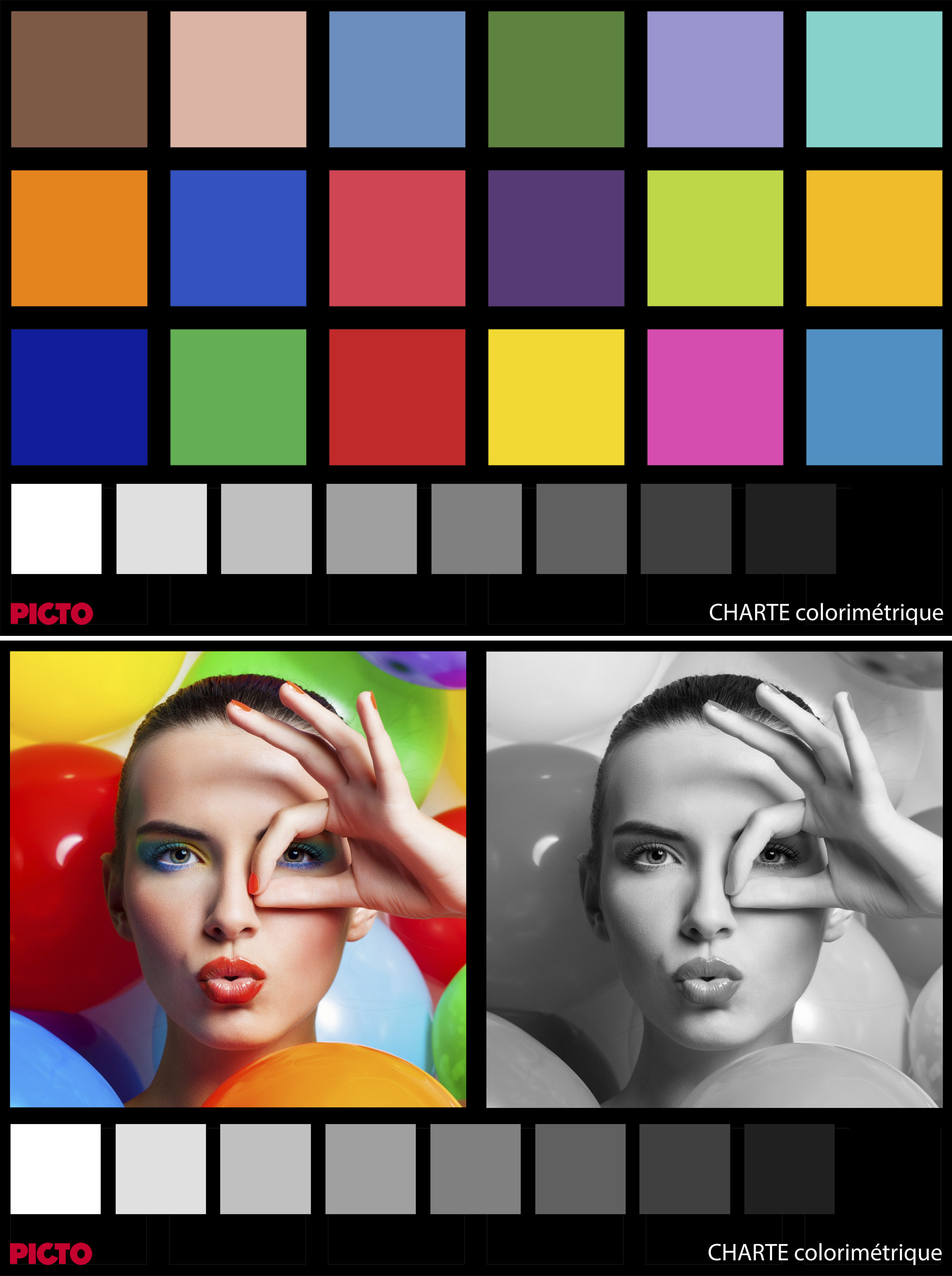
Download PICTO reference images
Here you can download examples of images that we use as references in PICTO.Once the files have been downloaded to your computer, you can visually check the consistency of the display on your screen (for example, make sure that the density blocks, from white to black, are all discernible, the portrait in black and white must be neutral, etc.).
Still using the downloaded files, you can also make your own reference prints via PICTO Online and then compare them with your screen and in your print viewing environment.
If you are in possession of a sample of PICTO "Le Book" paper (available in our shop), you can compare the cover and the prints present with the image display on your screen.
PICTO brand book:
PICTO Colour brand book - September 2019 V1et2 - ICC source profile : Adobe RGB 98Download the file
The PICTO Online Book :
Image used for "The Book" PICTO Online - September 2019 V1 - ICC source profile : Adobe RGB 98Download the file