Help / View Your Images and Prints
The working and viewing environment
Even before the digital equipment (screen and software), your working and viewing environment is crucial
The same image will be perceived completely differently depending on the lighting, the colour of the walls and the orientation of the screen (or print) in the room. Thus, a good estimation of an image (print or screen) depends first of all on a mastery of the viewing environment.
Coloured environment The coloured elements of a room (wall paint) have a direct impact on colour perception. For example, a green wall facing your screen will create a green lighting environment that will change the colour perception of your images.
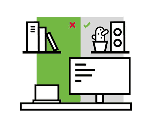
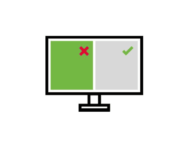
The background of your computer will also affect your perception, so avoid colourful, saturated and dark backgrounds. To avoid disturbing your eye's colour management, you may prefer a neutral medium grey. Positioning the ambient lighting
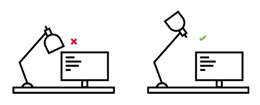
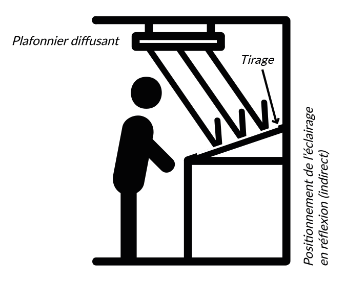
Avoid viewing your images with direct lighting (natural or artificial) on the print and/or screen.
The viewing equipment
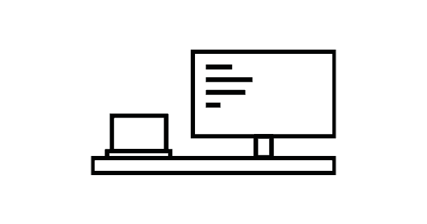
Your viewing equipment is important, whether it is a laptop or a fixed computer, it can display the colours of your images more or less well.
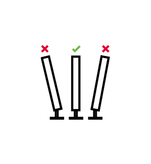
The positioning of the display in front of the visuals to be corrected or evaluated in terms of colour must be carefully checked.
Incorrect positioning can lead to an incorrect assessment of the hues, contrast and saturation of the image.
The positioning of your screen is important. Prefer a frontal positioning, at eye level.
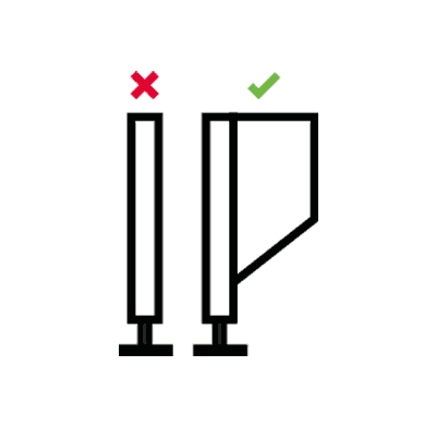
Beware of direct reflections (window and lighting), a reflection will make you perceive the image as duller and less contrasted than it really is. You should prefer indirect lighting.
You can add a protective cap to your monitor to limit stray light.
Use of a cap (optional)
Adjusting the brightness of your screen
Displays often come with a default brightness setting that is far too high for preparing photographic prints!
If this high brightness enhances the display of your image on the screen in order to obtain a flattering rendering, the amount of light is not adapted to prepare photographic prints which will be viewed under a much less bright light.
You should not hesitate to reduce the brightness by -30% to -50% compared to the factory setting.
For more information: "Adjusting or calibrating your screen"
In summary :
- Coloured background
- Coloured room (especially facing or behind the screen)
- Direct lighting of the screen and/or the room
- Coloured and overly tinted lighting (tungsten, fluorescent tubes, etc.)
- Skewed viewing of an image on the screen
- Brightness of the screen too high
- Medium grey wallpaper (#808080)
- Choose a neutral work area
- Place lighting indirectly (towards the ceiling for example). Small sources.
- Daylight/5000K/balanced LED sources
- Une position frontale face à un écran
- Adapter la luminosité de l'écran
Going further...
Light source
The type of light source chosen for the lighting of the work area is decisive for the correct visualisation of the colours of the images.
This means that colours will be perceived differently under different lighting conditions. Unlike electronic sensors, the human eye adapts to the environment.
As a result, differences in the colour tones (colour temperature) of light sources are only slightly perceived.
The brain makes an immediate adaptation in order to perceive objects according to our primary knowledge. For example, a banana will be perceived as yellow regardless of the lighting because that is its natural colour.
Each lighting has a tint, which influences the appreciation of colours in a screen or printed image.
For good viewing conditions, prefer lighting labelled "daylight" or "5000 K".
The perceived colour of an object depends on the source of the light. At 5,000 K (known as "daylight") the perceived colour will correspond to the actual colour.
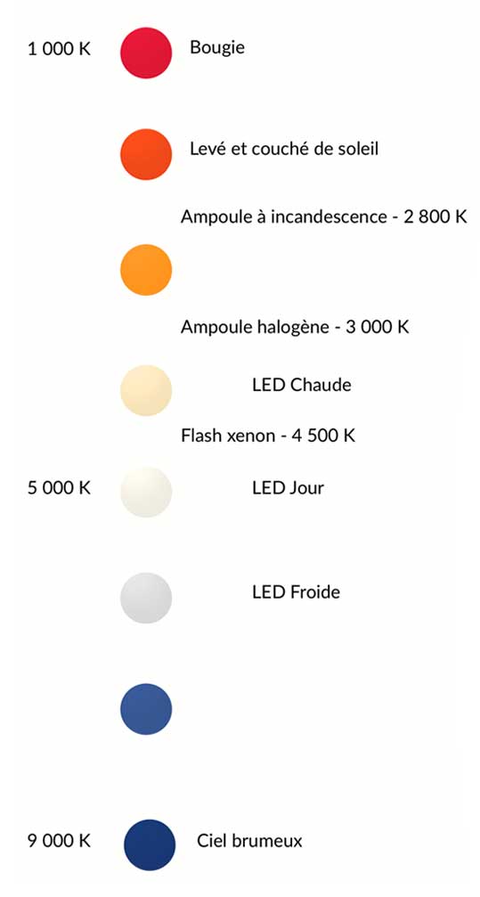
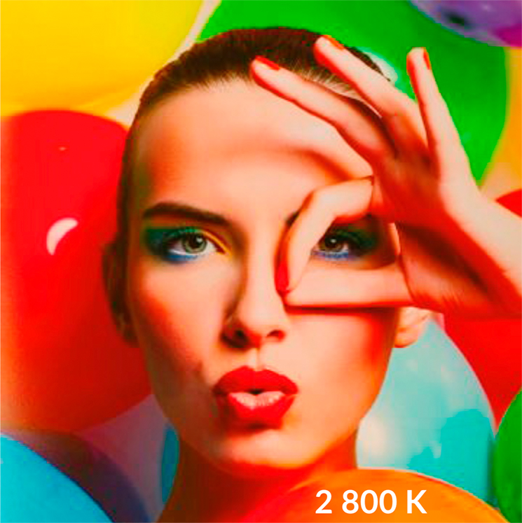 Incandescent bulb
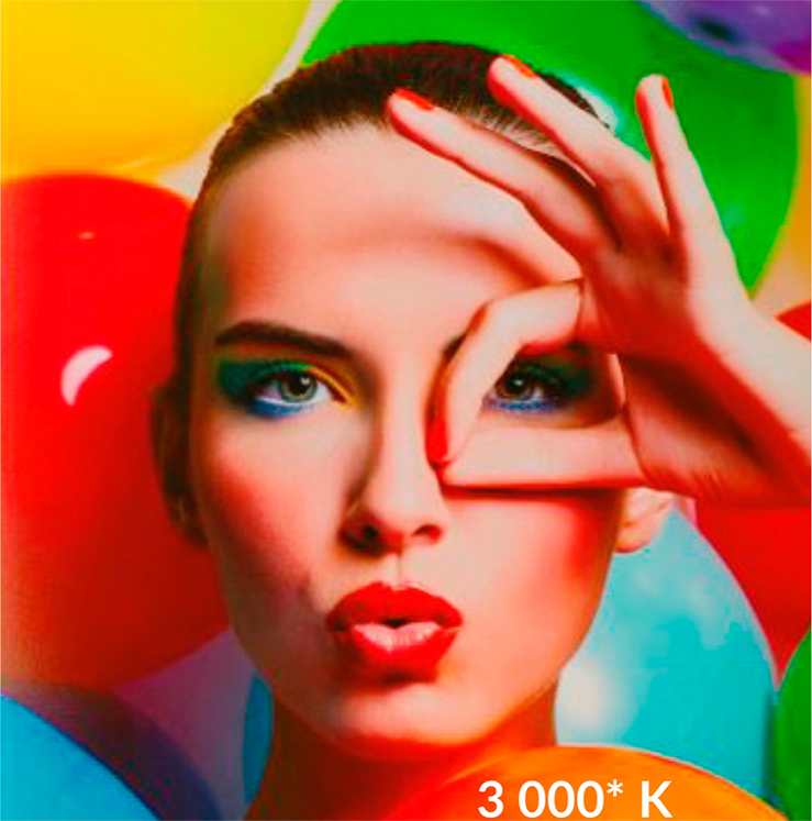 Halogen bulb
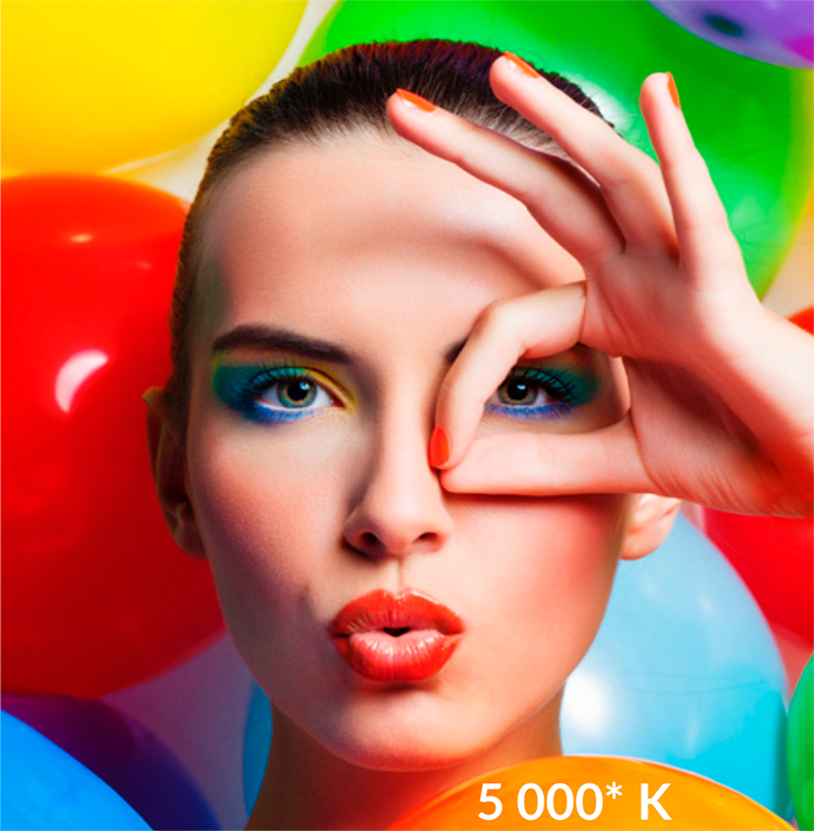 LED or fluorescent lamps Daylight
Concept of quality of light
Light sources are classified according to the quality of light they produce. This assessment corresponds to the ability of the source to reproduce colours correctly. A yellow banana would have to be seen as yellow under this lighting to be rated as having a correct CRI.
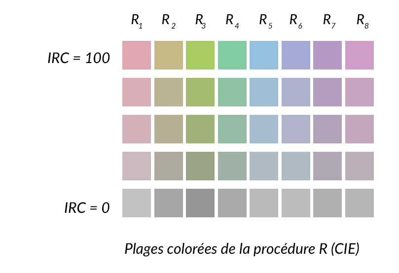
The CRI (Color Rendering Index) defines the ability of a lamp to provide a color rendering close to that obtained under daylight (CRI=100).
The CRI is determined using 8 colour ranges, which corresponds to the standardised Ra procedure (set up by the CIE Commission Internationale de l'Éclairage) followed by all light source manufacturers. The scale is relative and goes from 0 to 100. It is indicated on the packaging of the various light sources, along with their power (in watts) and colour temperature.
| Source | IRC | Colour temperature (Tc) | Life |
| à Incandescent | 100 | 2800 K (incandescent bulb) 3200 K (halogen bulb) | 1000 h 2000 h |
| à HMI (metal halide) | 80-95 | approx. 6000 K | 1000 h |
| Sodium | 20-65 | 2000 K | 20 000 h |
| Fluorescent tubes (incorrectly called neon tubes) | 80-98 | between 3200 and 5600K depending on the model | up to 15 000 h |
| LED | 95 | Varies according to model 2700 à 5500 K | 50 000 h |
LED : Very good combination IRC/Tc/lifetime but more limited accessibility to this type of lighting for Tc equivalent to daylight.
Most commercially available LEDs are at 2700 K°. Certified 5500 K and high CRI lighting is available.
Notion of quantity of light
The power of the light source used to observe the print will lead to a different perception of the print. A print that is over-lit (with a strong light source at close range) will result in poor colour and contrast judgement.
In order to choose a light source suitable for judging prints, it is necessary to have an optimal combination of the following parameters: CRI (quality of light) between 90 and 100, balanced colour temperature (close to 5500 K° (daylight)) and a suitable power in order to obtain an observation plane collecting 2,000 lux (10 cm for 70 W).
Suitable lighting solutions available on the market
Most light sources on the market are not suitable for lighting a colour observation booth. The most common colour temperature is 2700 K, known as "warm white", which is perfectly suitable for a domestic lighting environment.
For the print viewing station (paper prints), you need to choose a light that you can install above your paper print. For this purpose we recommend the use of fluorescent tubes or LED tubes, as their lengthwise geometry allows even illumination of the entire print.
You can also opt for a standardised solution for photographic work proposed by JustNormlicht.
Ordre de prix des sources lumineuses adaptées
| Type | Tc | IRC | Power | Installation | Brand | Price (€) |
| Fluorescent tube | 4 000 ou 6 500 K | 80 - 89 | 10 à 79 W | Tube | Philips Osram Sylvania |
2 to 10 |
| LED | 4 000 ou 6 500 K | 80 - 89 | 4 to 6 W eq.* 49 to 80 W | Tube | Philips Osram Sylvania |
6 to 20 |
| Integrated LED | 5 000 K (D50) | 93 | 1,5 W eq.* 25 W | Tube integrated in a ceiling light from | JUST Normlicht | from 60 |
Criteria to be met
- Light source at a distance of 10 cm for a 70 W equivalent LED bulb (equivalent to the 2,000 lux of the ISO 3664:2009 P1 standard for judging printed images).
- 45° tilt for positioning the print in relation to the source to avoid reflections.
- Diffuse or reflected light
- Source power 70 Watt maximum (or equivalent for LEDs).
- Type of source: Daylight fluorescent tube (5000 K) or daylight LED (5000 K).
ISO 3664 and ISO 12646 viewing conditions: screen and light table
In order to be in stable and reproducible conditions for judging images and prints, PICTO uses calibrated screens and standardised judging tables (JUST desks and light tables).
Picto complies with the ISO 3664:2009 standard concerning critical viewing conditions for professionals (illuminance for critical comparison = condition P1).
This standard complements the ISO 12646:2008 standard which is currently under revision.
The illuminance of the critical viewing plane should be 2.000 lx (± 500 lx) and a colour temperature of 5.000K (± 500 K). Inside the PICTO lab, we are set at a luminance of 120 cd/m² for our screens with observation posts at 2000 lx.
In normal hanging or practical viewing mode, the amount of light is often closer to 500 lx (± 125 lx , indoor ambient illuminance = condition P2). This implies a too dense photo print feeling that needs to be manually compensated on the file before sending it.
In general, a mid-tone brightening can compensate for the difference in density between the screen display and the actual rendering of the photo print with P2 illumination.
The other way to compensate is to have a screen with a lower luminance: 90 cd/m² (± 10 cd/m² ).
Link to ISO publications : www.iso.org/iso/fr